A whole-home color palette makes every room feel connected, even if each room has its own personality. When the same few colors repeat from room to room, the home feels calm and planned. When every room has a completely different scheme, it can feel disjointed, especially in open-plan spaces.
Here is a simple seven-step method that works for owners and renters alike, followed by ready-made palettes, a room-by-room plan and the most common mistakes to avoid.
Step 1: Start With What Stays
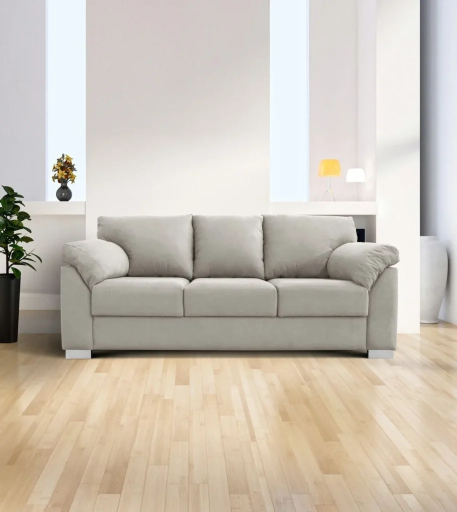
Floors, kitchen cabinets, a sofa or a rug you love often decide the palette. Build around them.
Make a list of the fixed or expensive things in your home: wood floors, tiles, countertops, a large sofa or a favorite rug. Note their colors and undertones. Every paint color and accent you choose should work with these pieces, because they are the hardest to change.
Step 2: Choose a Mood

Calm and airy? Warm and cozy? Moody and dramatic? Mood decides whether you lean light, warm or dark.
Look at the rooms you have saved on Pinterest or in magazines. Do they feel bright and fresh, soft and earthy, or deep and enveloping? Most people find their mood is consistent, even across very different rooms.
Step 3: Pick a Main Neutral
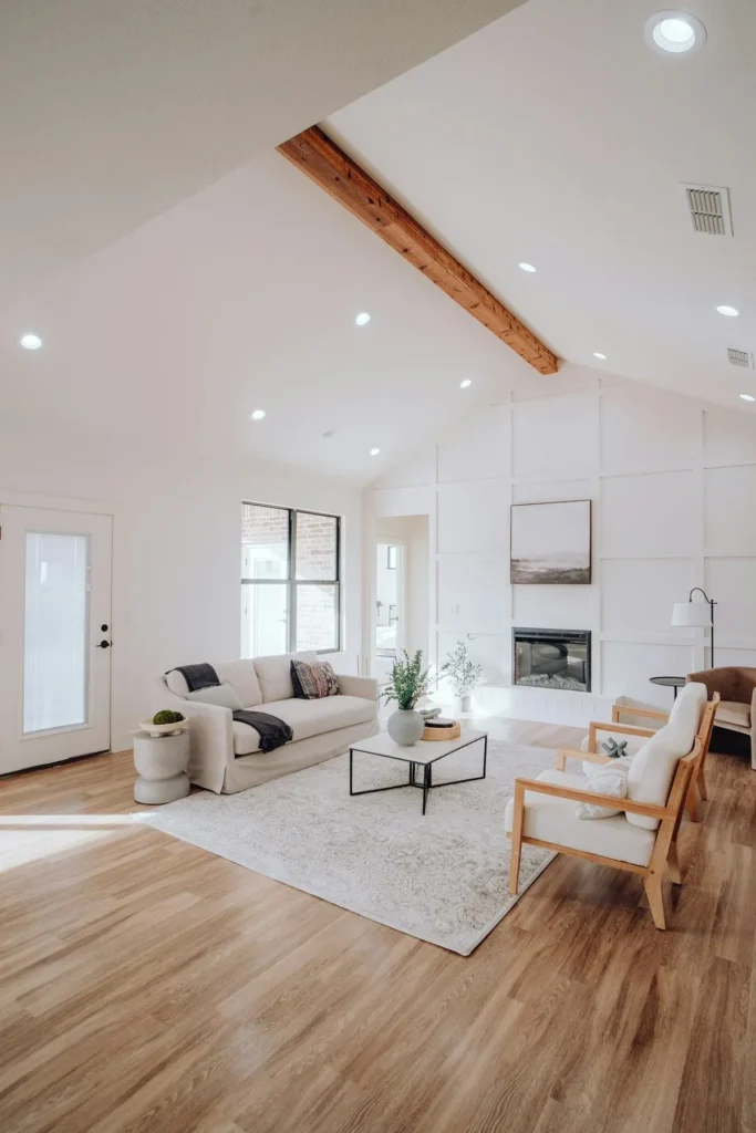
Choose one warm white, cream or greige to use across most walls. It ties the home together. Hallways, landings and connected rooms in particular look best in one consistent neutral.
You can still use a different color in a bedroom or powder room. The main neutral simply acts as the thread that runs through the whole home.
Step 4: Use the 60-30-10 Rule
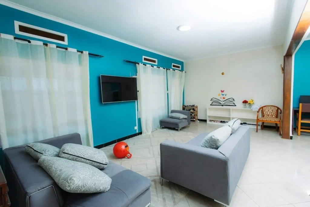
About 60% base color, 30% secondary and 10% accent, as explained by Apartment Therapy.
In practice, the base is usually walls and large rugs, the secondary color is furniture, curtains and bedding, and the accent appears in cushions, art and small decor. Natural wood, black and metallic finishes act as neutrals and don’t count toward the three colors.
Step 5: Check Undertones
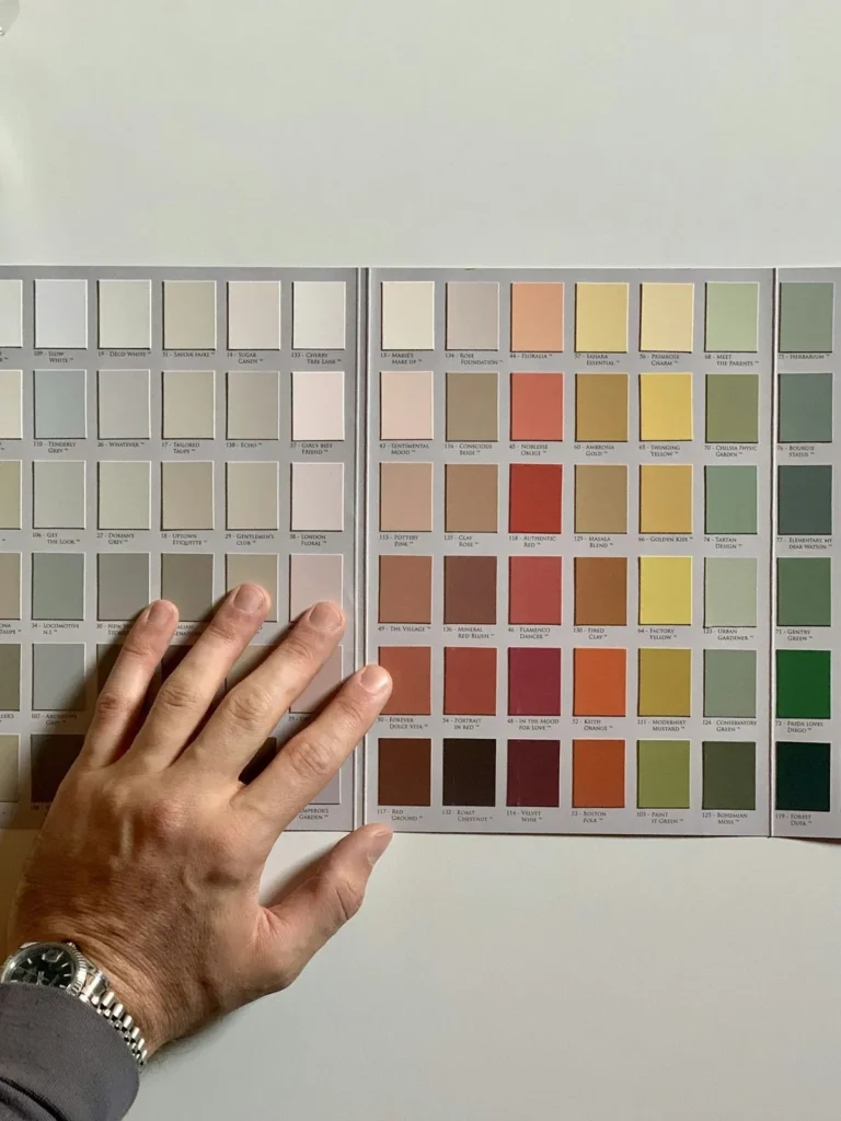
Greys can lean blue, green or purple; whites can lean yellow or pink. Compare samples next to your floor and sofa.
A quick trick is to hold a paint sample against a sheet of plain white printer paper. The undertone becomes much easier to see. Choose colors whose undertones match your fixed pieces; a pink-beige can clash with a yellow-toned wood floor.
Step 6: Consider Your Light
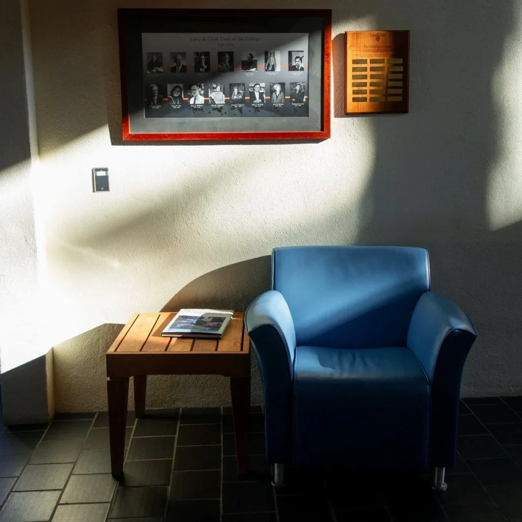
North-facing rooms get cooler light, so warmer colors often look better. South-facing rooms handle cooler shades.
East-facing rooms are bright in the morning and cooler in the afternoon, while west-facing rooms are the opposite. Artificial light matters too: warm white bulbs make colors look warmer, and cool bulbs make them look cooler.
Step 7: Test Before You Commit
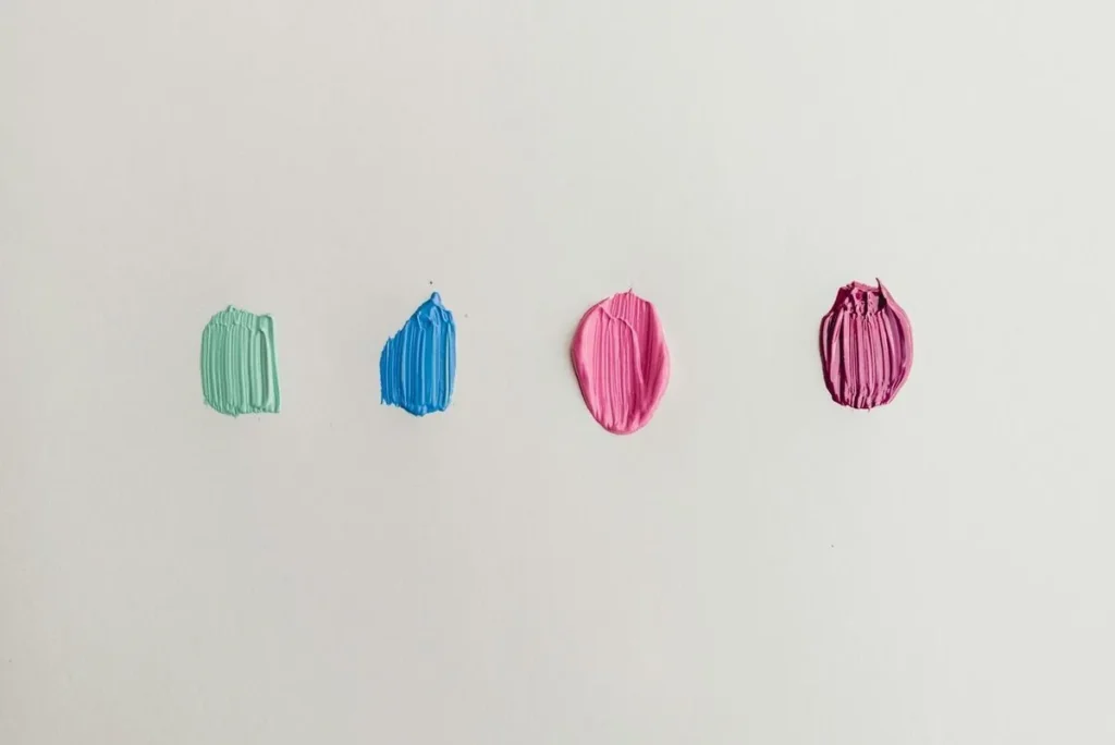
Paint large sample boards and look at them morning and evening for a few days. Move the boards around the room, next to the floor, the sofa and the window.
Peel-and-stick paint samples are an easy way to test several colors without painting the wall.
Easy Whole-Home Palettes to Try
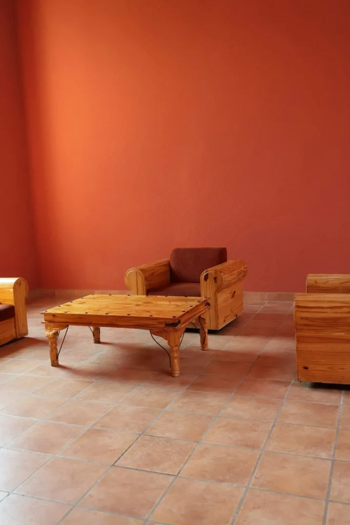
| Palette | Base | Secondary | Accent |
|---|---|---|---|
| Warm natural | Warm white | Oatmeal | Olive |
| Coastal calm | Soft white | Pale blue | Navy |
| Earthy | Cream | Mushroom | Terracotta |
| Modern classic | Greige | White | Charcoal |
Use the base on most walls, the secondary color in furniture and textiles, and the accent in small doses in every room.
How to Flow Color Between Rooms
- Connected spaces: use the same base color on walls that can be seen together.
- Repeat accents: if the living room has olive cushions, add an olive throw in the bedroom and a vase in the hallway.
- Shift intensity: use a lighter tint of a color in one room and a deeper shade in another.
- Keep trim consistent: use the same white for doors, skirting and trim throughout.
Room-by-Room Tips
- Living room: a calm base with your accent in cushions and art. See living room color palette ideas.
- Bedroom: softer, muted colors for rest. See bedroom color ideas.
- Kitchen: work with cabinets and countertops first, then add color in textiles and accessories.
- Bathroom: light colors make small bathrooms feel larger; towels can carry the accent.
- Hallway: your main neutral, to tie every room together.
Common Palette Mistakes
- Choosing paint first. Start with floors and furniture.
- Too many colors. Two or three plus a neutral is enough.
- Ignoring undertones. They cause most color clashes.
- Not testing in your own light. Colors change from room to room.
Frequently Asked Questions
How many colors should a home have?
One main neutral throughout, plus two or three accent colors repeated in different rooms.
How do I make colors flow between rooms?
Use the same base color in connected spaces and repeat accents in textiles and decor.
What is the best neutral paint color for a whole house?
A warm white or soft greige works in most homes, because it suits both warm and cool furnishings. Test it in your own light first.
Can every room be a different color?
Yes, but tie them together with a consistent trim color and repeat at least one accent color in each room.
Final Thoughts
A good color palette starts with what is staying, such as floors and big furniture. Choose a mood, pick a main neutral, use the 60-30-10 rule and check undertones in your own light. Always test samples on the wall before committing. With a clear palette, every room will flow naturally into the next.
See living room color palette ideas, bedroom color ideas, or go back to how to decorate your home.




Leave a Reply